Habipets
Pet care services app for the UAE
The starting point
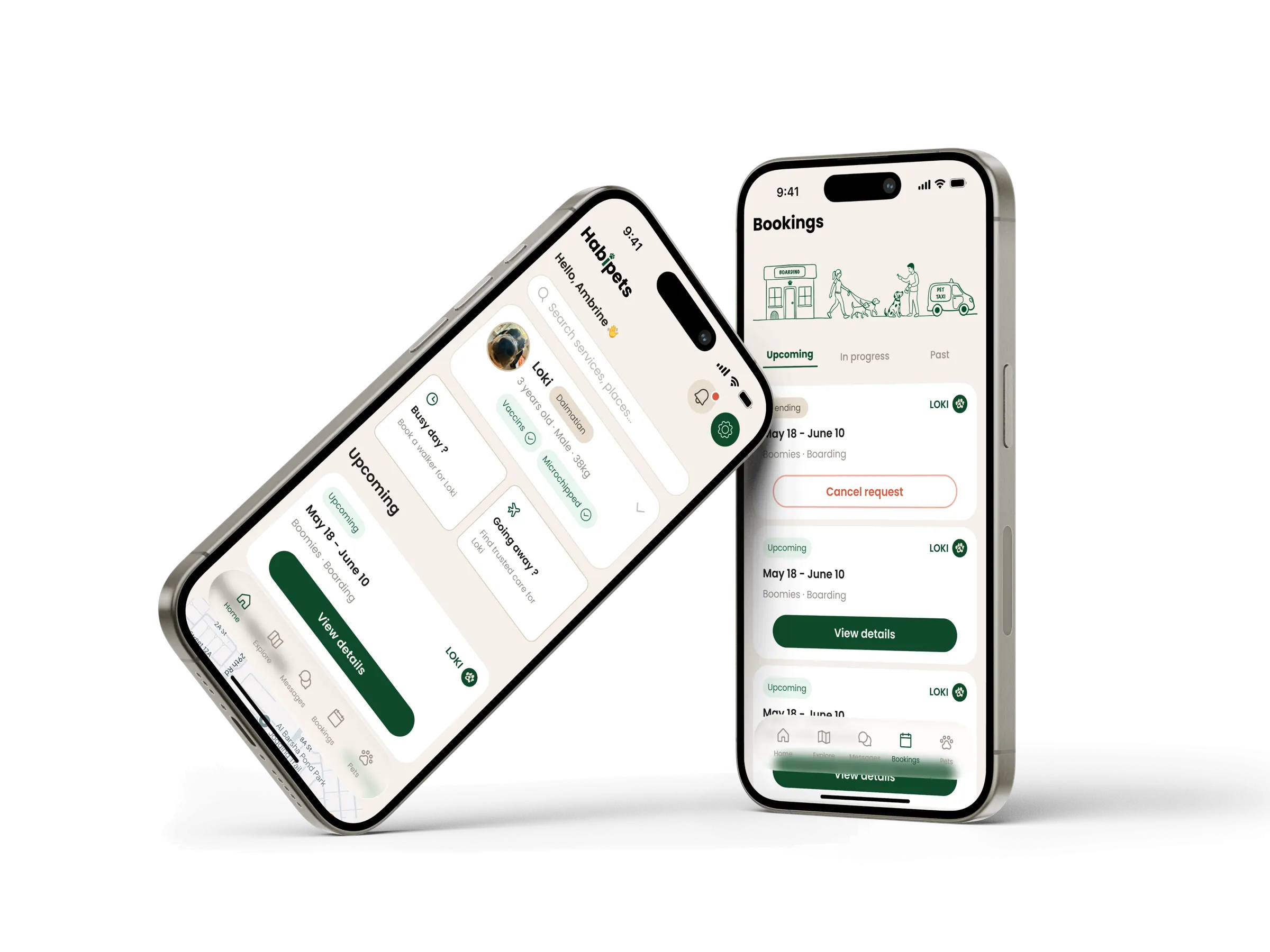
When I needed care for my own dog, the apps available in the region felt clumsy, cluttered screens, confusing booking paths and interfaces that clearly weren’t built for this market. The service was there, but the experience got in the way.
 is my answer. One app to find and book trusted pet care across the UAE: walkers,
sitters, daycare, boarding, pet taxi or trainers.. with a flow that stays simple
from the first tap to confirmed booking.
is my answer. One app to find and book trusted pet care across the UAE: walkers,
sitters, daycare, boarding, pet taxi or trainers.. with a flow that stays simple
from the first tap to confirmed booking.
Built for the local market, in its own visual language.

Who I’m designing for
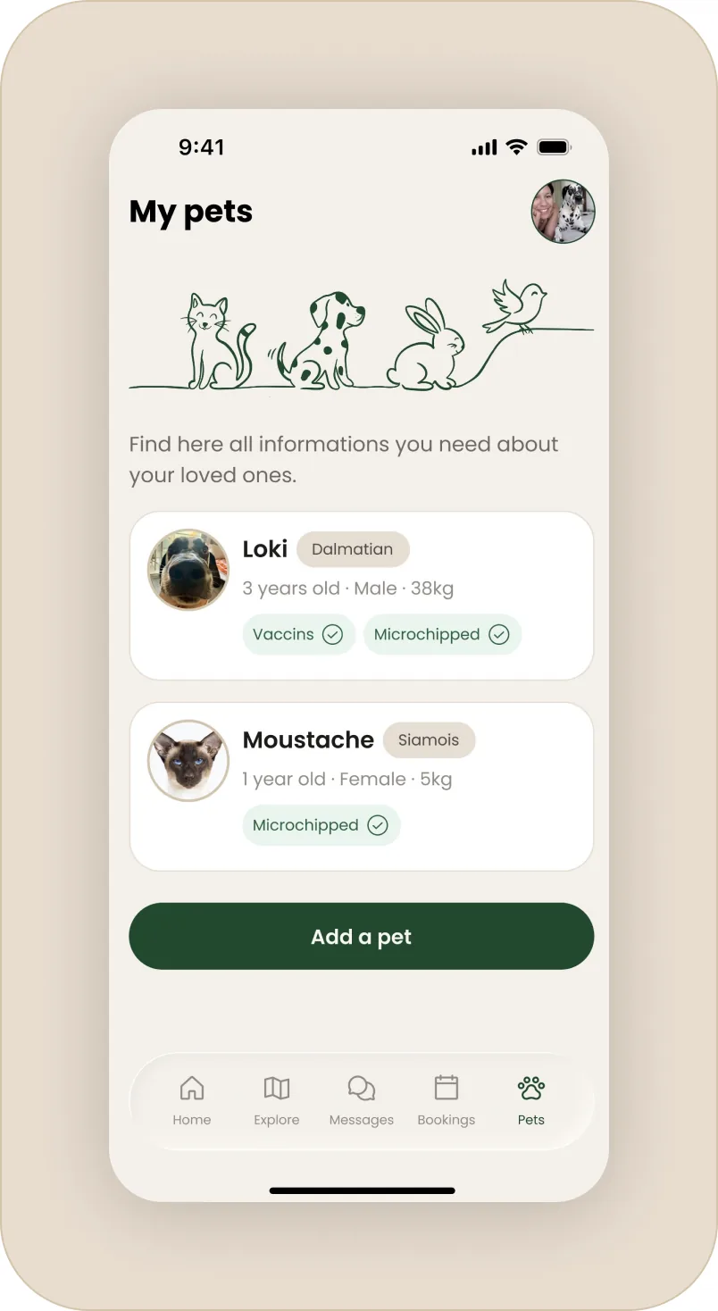
I designed around pet owners in the UAE who want reliable care without a fight with the interface.
Ambrine and Loki in Dubai. A busy owner who needs a walker on short notice, trusted boarding when travelling, and the reassurance that whoever takes their dog is a real verified person.
Three needs shaped every decision that follows:
- Finding the right service fast, whatever the need: a walk today, or boarding next month.
- Trusting a stranger with a pet: verification, reviews and clear terms had to be visible.
- A single, familiar flow across every service, so nothing feels like relearning the app.
The decisions that matter
The screens are what you see. What you don’t see is the reasoning behind them, and that’s where the real work is.
One flow for six services
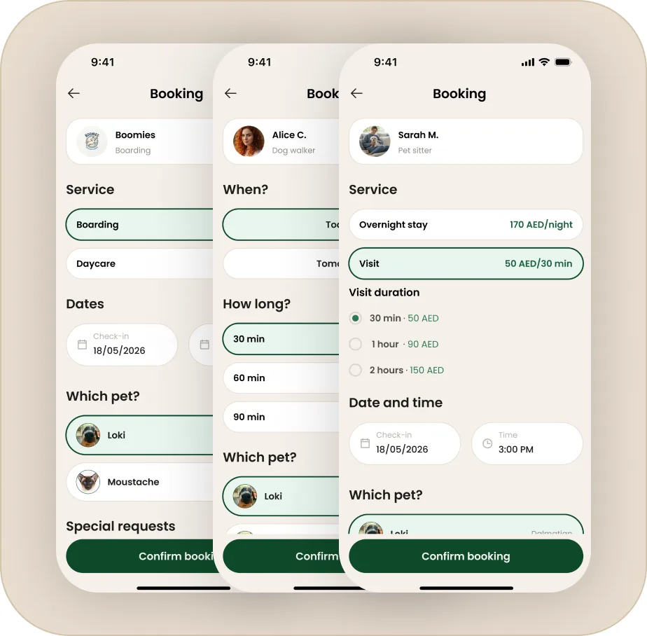
Habipets offers six different services and the fastest way to lose a user is to make each one behave differently. So I built a single, repeatable flow: browse → filter → provider profile → booking → confirmation, and applied it to every service. A walker and a boarding facility are booked the same way, even though what’s booked is very different.
The payoff is that the app only has to be learned once. Behind the scenes, each service adapts its own fields (a walk has a duration, boarding has check-in and check-out dates), but the path never changes.
Trust made visible
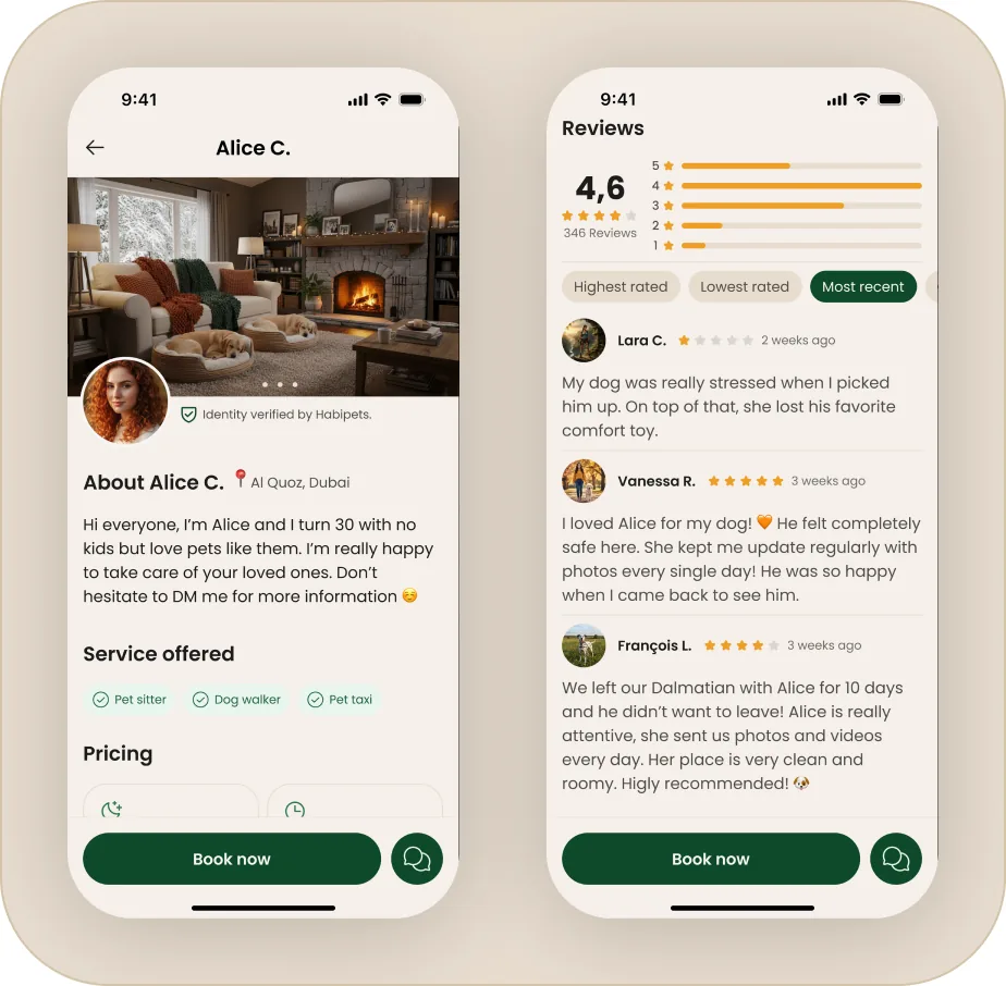
Handing a pet to a stranger is the emotional core of the app, so trust couldn’t be implied, it had to be on screen.
Every provider carries an « Identity verified by Habipets » badge, a real rating with a full review breakdown, and clear upfront pricing.
Provider profiles show home details, accepted pets, payment methods and availability so the decision is made with full information before any booking.
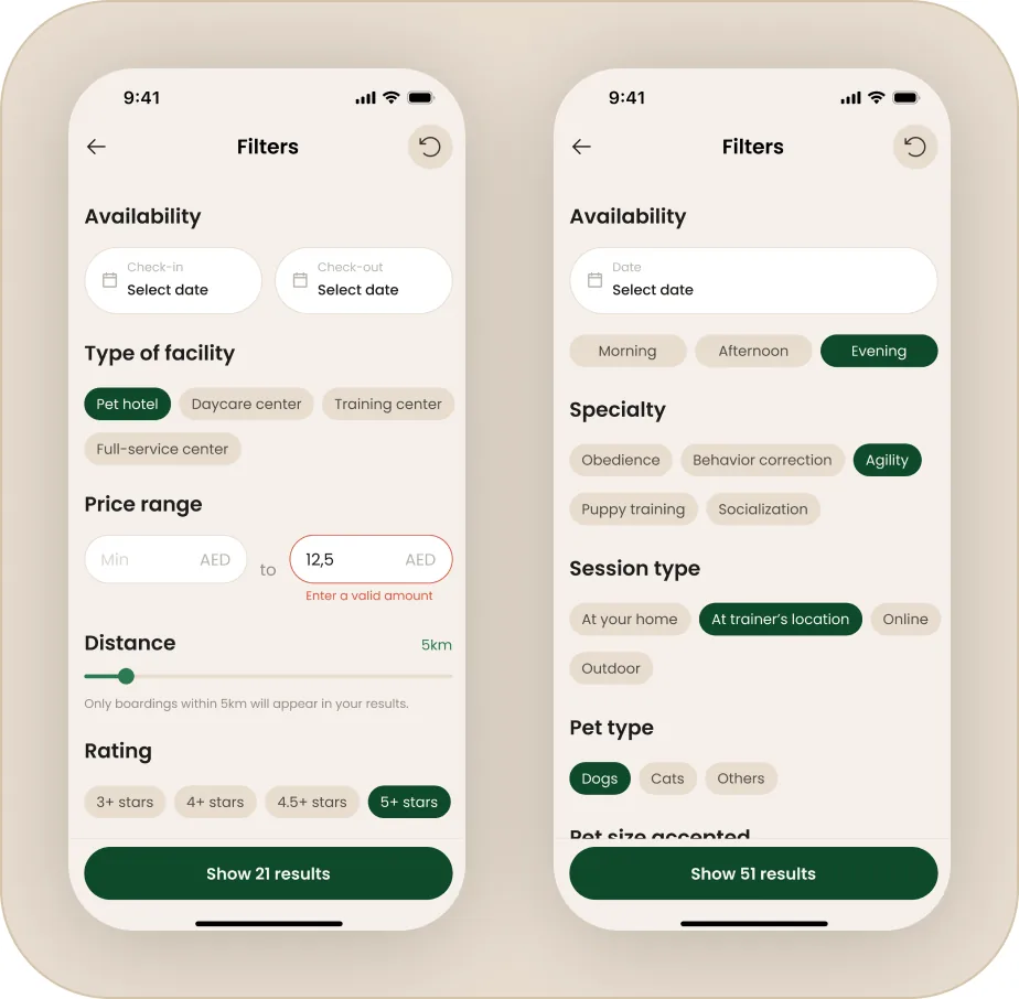
Filters that match how people search
Each service has its own realities, so a single generic filter would fail. A walk is filtered by duration and time of day, boarding by check-in date, pet size accepted and amenities, a pet taxi by vehicle type.
I designed the filters per service rather than forcing one template, so the options on screen always match what actually matters for that booking.
Designed for the local market
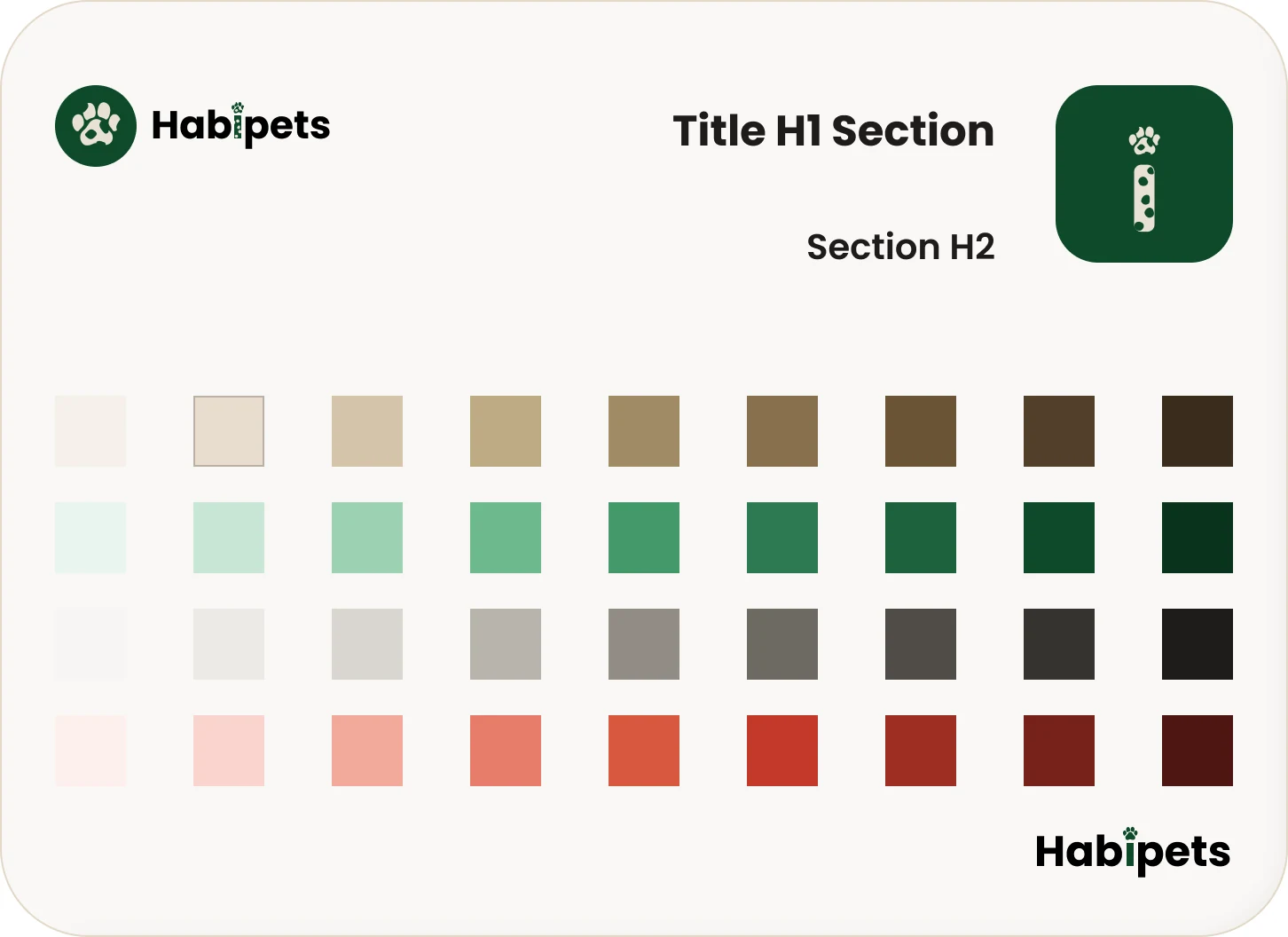
The apps I compared felt generic, nothing tied them to the region. Habipets is grounded in it: pricing in AED, real Dubai neighborhoods, local providers and a warm palette drawn from the market.
It’s a small thing that changes how native the app feels and it’s a deliberate answer to competitors who ignore it.
Honest booking, even when it fails
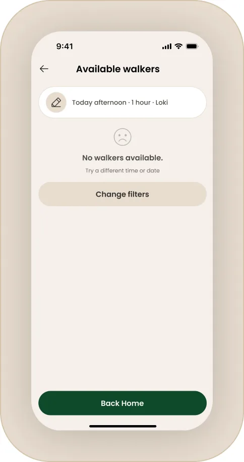
A booking flow is only as good as its edge cases. When no provider is available for the chosen slot, the app says so plainly and offers to change the filters, rather than showing an empty screen.
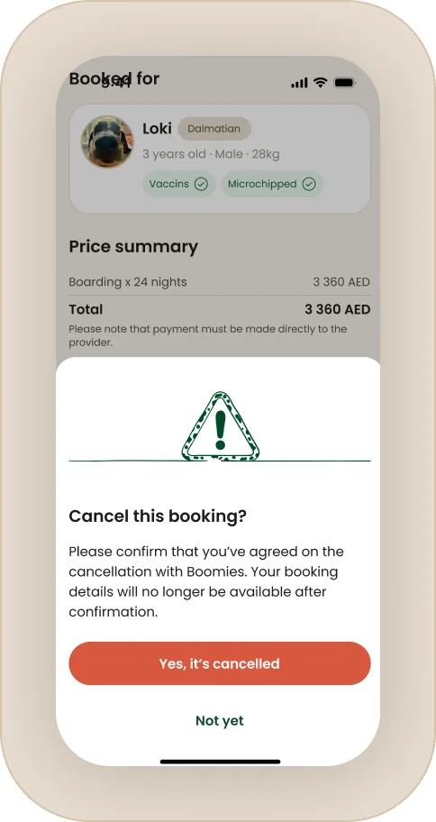
Confirmation makes the terms clear: the provider has a set time to accept, and if they don’t, the owner is invited to book another. Cancellation asks for explicit confirmation, because it’s irreversible.
The system
The whole app holds together because of a system I built as I went.
Colors: a warm cream and deep emerald palette, with a red reserved for destructive actions and neutrals for structure.
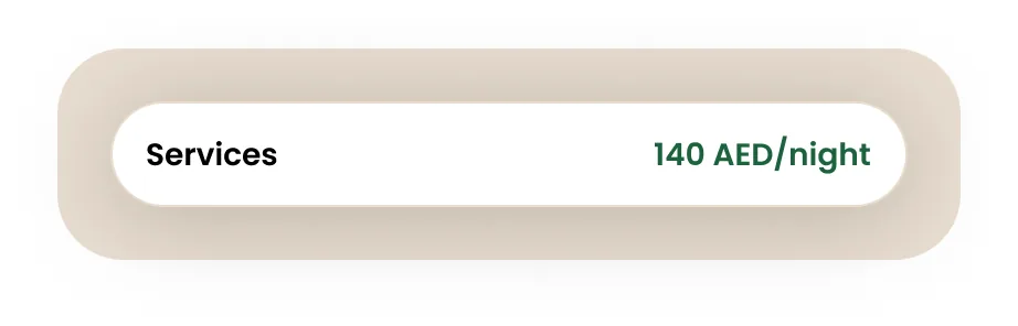
Local grounding: AED pricing, UAE locations, verified providers, throughout.
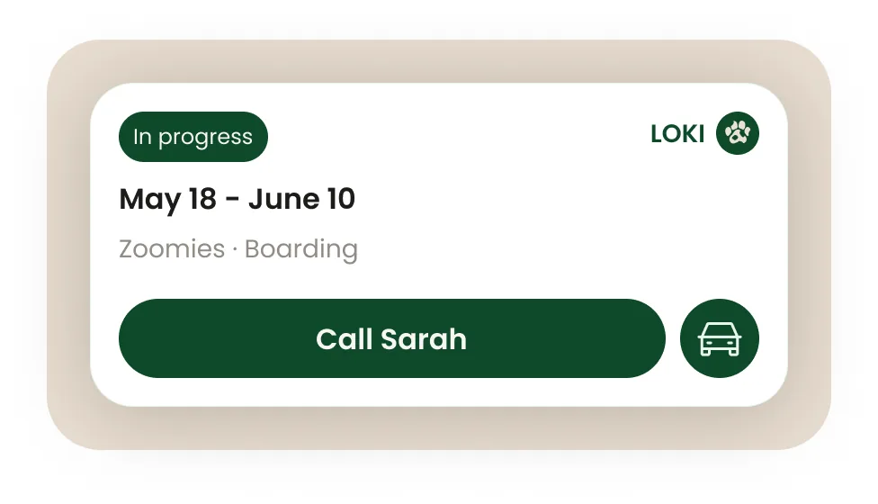
Structure: one booking flow, reused everywhere, with service-specific fields swapped in.
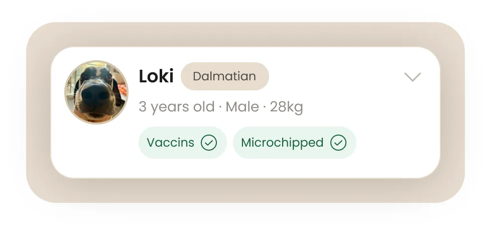
Components: chips for filters and selection, provider cards, booking summaries, all consistent across the six services.
What it took from it
is a concept project, designed end to end in Figma, covering six services and their
full booking journeys.
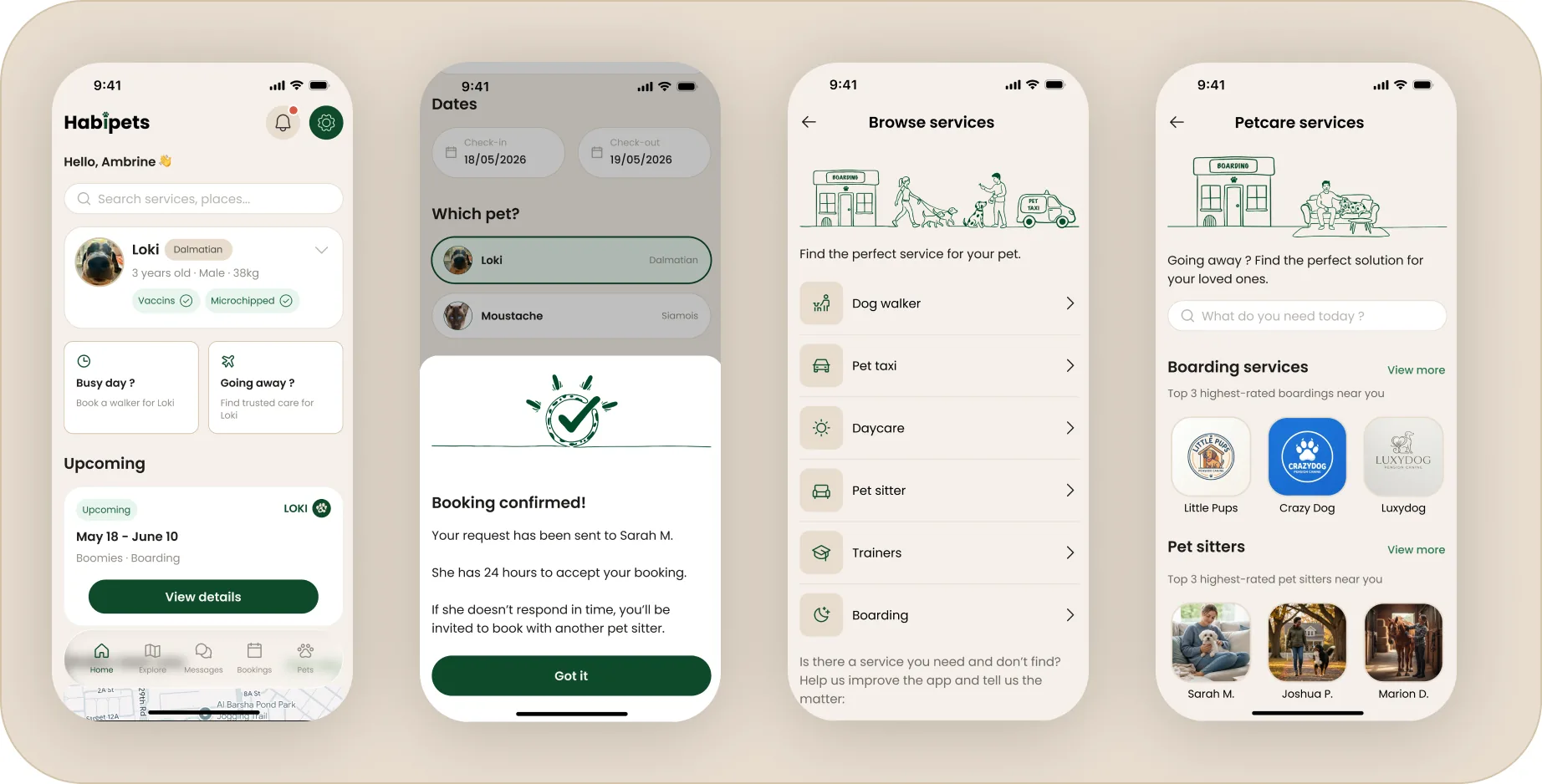
The hardest and most valuable part wasn’t any single screen, it was making different services feel like one coherent app. The discipline of designing a flow once and trusting it everywhere taught me more about systems thinking than any individual interface.
Good design here meant restraint: resisting the urge to make each service special, so the whole thing stays effortless.
Have a project in mind? Let’s talk.
Available for freelance projects, remote or in Dubai.
contact@ambrinedeguerville.com