Walkers
A community walking app for people who love to walk.
The starting point
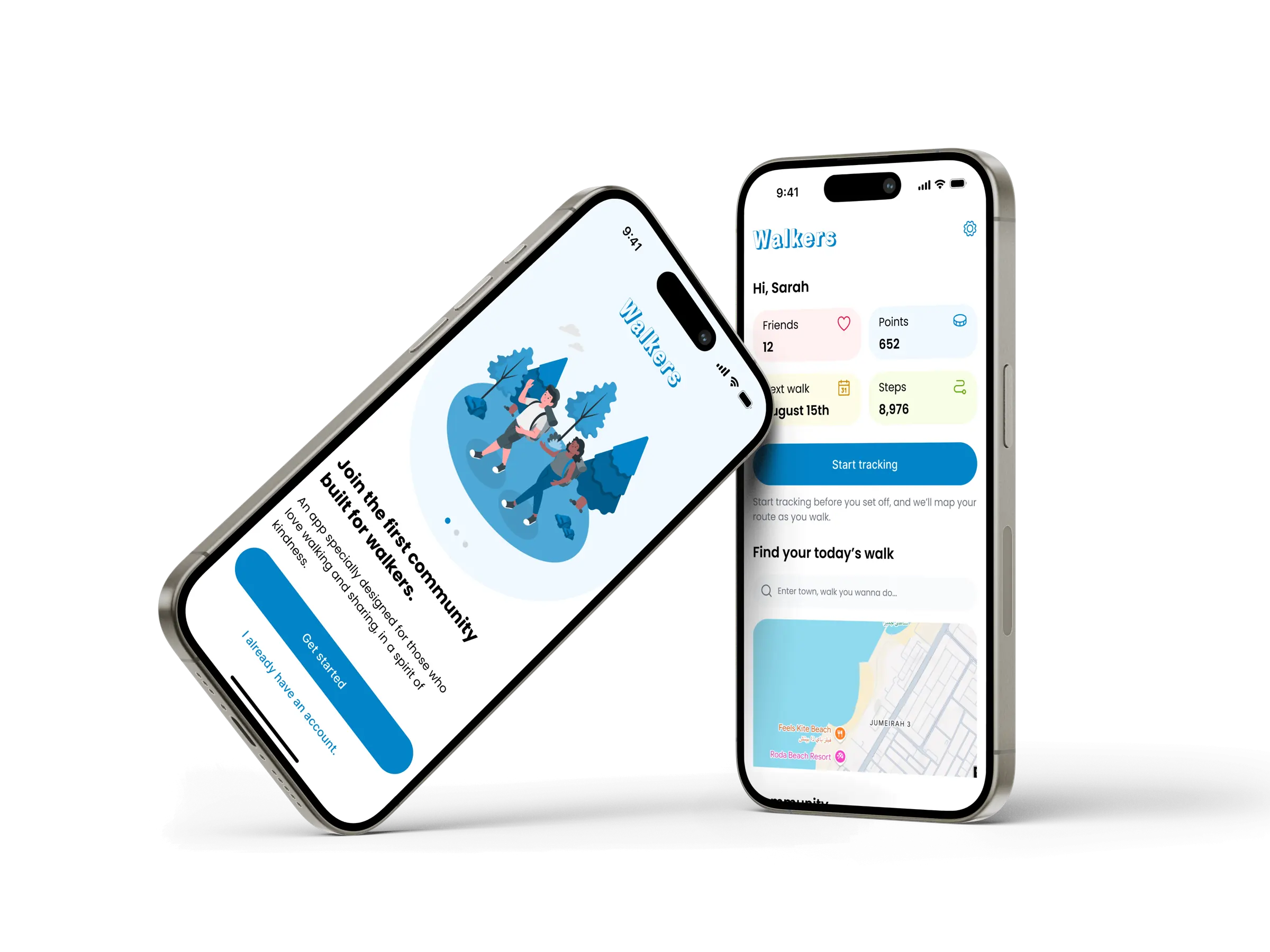
I love walking. Not running, not chasing records. Just walking, discovering a place, then coming back wanting to show it to someone. When I went looking for an app to do that, all I found were tools built for athletic performance: pace, records, leaderboards. Nothing for people who just want to keep a record of a good walk and share it, without the competition.
Walkers came out of that gap. An app where you record your walks, discover other people’s, and where walking with a stranger doesn’t feel scary. One thread runs from the first screen to the last: kindness, not competition.
Who I’m designing for
I built the design around a profile I know well, one that isn’t far from my own.
Sarah, an expat in Dubai. She’s just arrived, doesn’t know anyone yet, and walking is how she explores a new city. She wants to keep her routes in memory, discover new ones, and maybe meet people around something simple.
Three needs shaped every decision that follows :
- She wants an app that isn’t about performance.
- She’s cautious about meeting strangers online, especially as a woman walking alone.
- She wants it to be fast: logging a walk shouldn’t feel like a chore.
These three points show up everywhere in the design.
They are not details, they’re my starting constraints.
The decisions that matter
This is where the real work happens. The screens, you can see. What you can’t see is the thinking behind them. Here are the trade-offs I’m most proud of.
Two ways to add a walk
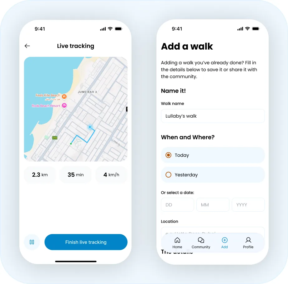
« Add a walk » is really two different intentions, and they can’t share one screen. You either record a walk live, with GPS drawing the route as you go, or you log a walk you’ve already done from memory with no route to show.
I designed two distinct flows so each screen does exactly what it promises. Live tracking starts from the home screen and centers on the map. Manual entry is a form with no map, where the details are filled in by hand. No empty map pretending to hold a route that was never recorded.
Input that stays effortless
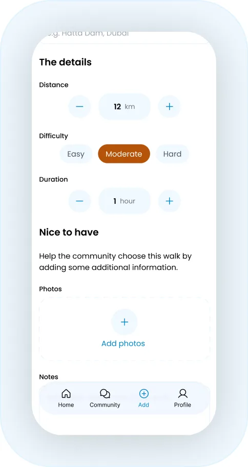
For manual entry, I chose steppers and selectors over text fields. Typing « 2.5km » or « 1h15 » means a keyboard and ten possible formats, friction on data that doesn’t need to be exact.
For a walk logged from memory, precision to meter adds nothing, so I traded it for speed.
Two taps instead of ten. The data matters less than how comfortable it is to enter.
One color, one role
With more than one accent color in play, the interface needed a system to stay readable. I gave each color a single job: blue for actions (buttons, steppers) and amber for selected or active states (a chosen option, a filter, a toggle switched on).
Sky600#0284C7
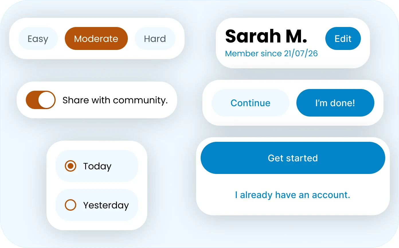
Two colors, two roles, never mixed so the eye always knows whether it’s looking at an action or a choice.
Amber700#B45309
Illustrations where they belong
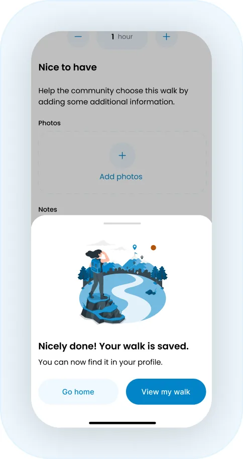
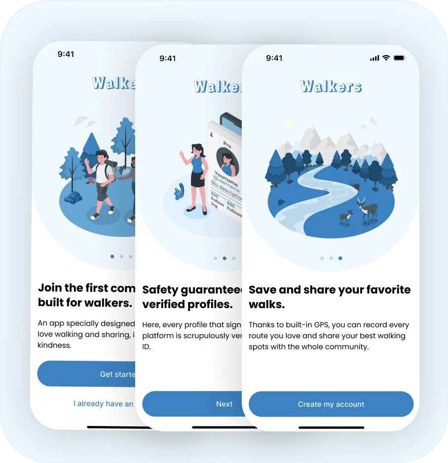
Illustrations carry emotion, so I kept them for moments that call for it. Onboarding and the confirmation screen after a walk is saved. On a form, they only compete with the task, so there’s none.
Warmth where it helps, clarity where it counts.
Built for 60 walks, not 3
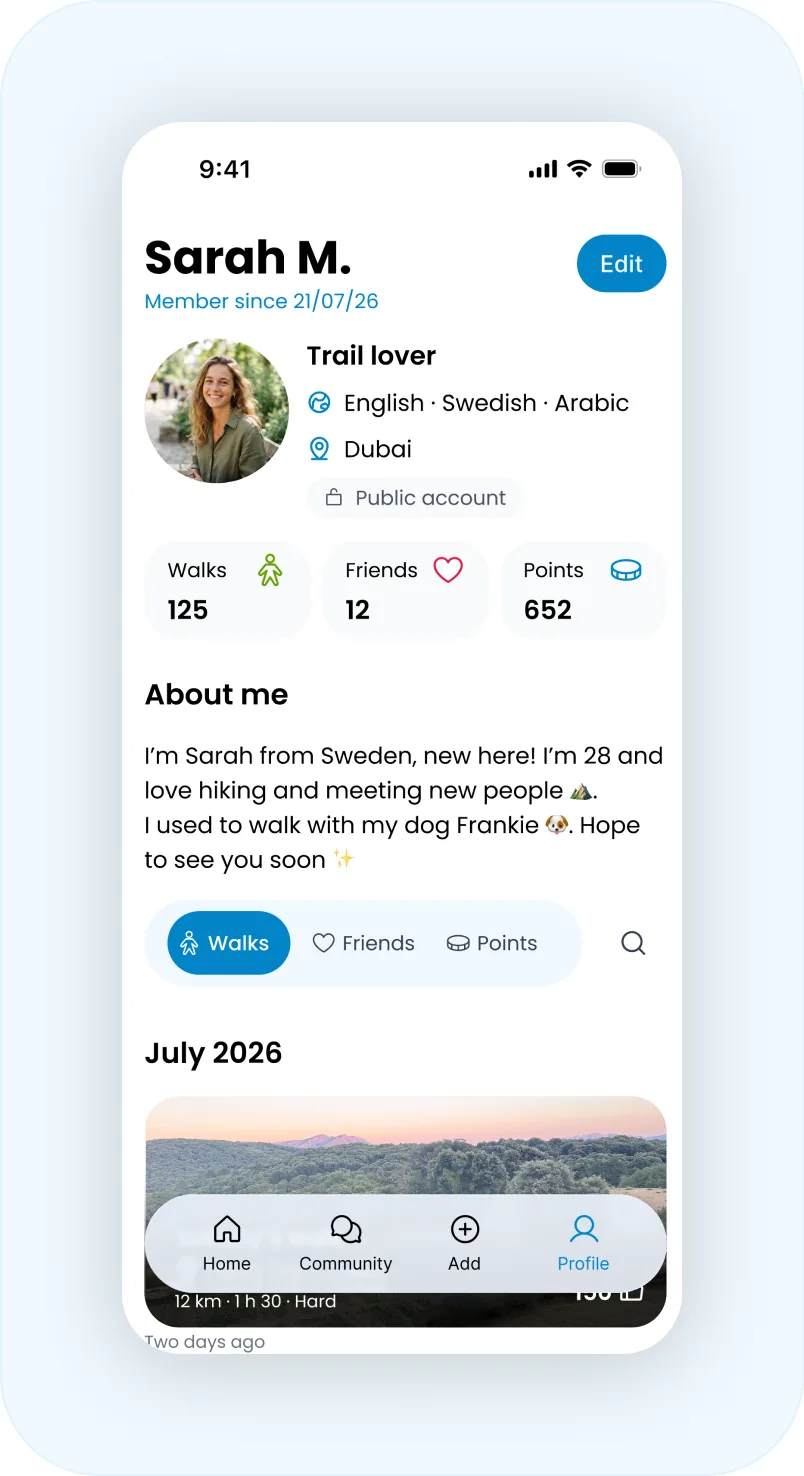
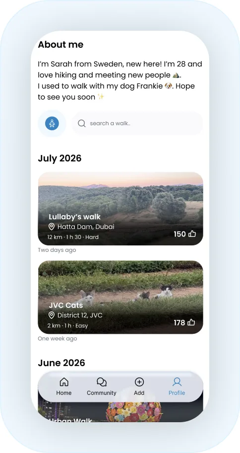
A list of walks is simple with three. With sixty, it becomes an endless scroll. I designed the list to scale from the start: walks are grouped by month for a sense of time, and search sits one tap away to jump straight to a specific one.
Structure and function, without weighing the page down.
Safety, by design
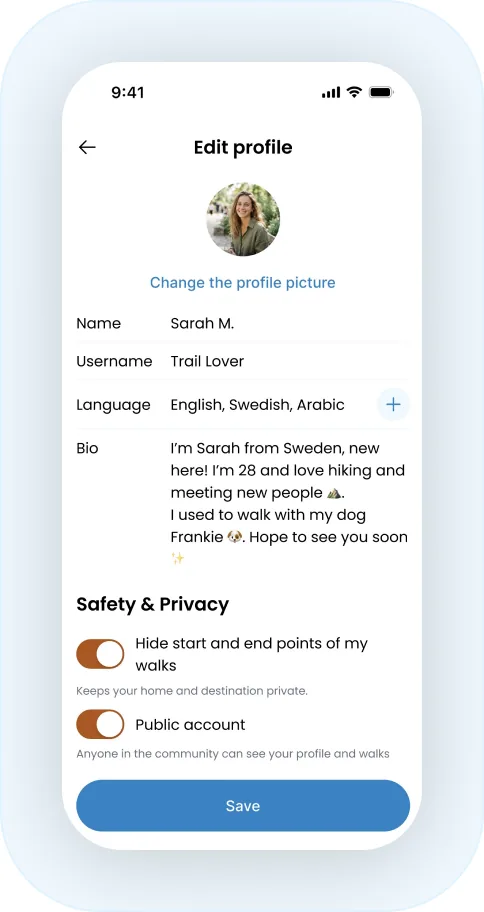
Walkers invites people to walk with strangers, and that only works if they feel safe. Public-by-default would have served the community spirit, but it ignored a real need: a woman walking alone wants control over her visibility.
That’s why the profile keeps a clear privacy setting, readable at glance. A deliberate product choice.
Accessibility, not an afterthought
Accessibility built in. I checked the amber against its text with Stark rather than trusting my eye, and tuned the shade until it met WCAG contrast levels. It’s the kind of detail no one notices when it’s right but everyone feels when it’s wrong.
WCAG Friendly
The system
These decisions hold together because of a small system I built as I went, rather than choosing screen by screen.
Colors: Blue for action, Amber for selection and active states, Neutrals for background and text.
Spacing: a strict scale 8px between label and its field, 16px between fields and 24px between sections.
Type: three clear levels: Screen title, Section title and Label. Nothing more.
Components: steppers, chips, cards, toggles, consistent from one screen to the next.

What it took from it
Walkers is a concept project, designed end to end in Figma. Every screen was built as one link in a flow, never as a standalone image.
What it taught me most is that good design is rarely measured by what looks nice, but by what’s been resolved.
The most useful questions were never about color, they were about intent: what do they actually want to do here, and how do I remove every bit of friction between them and doing it.
Have a project in mind? Let’s talk.
Available for freelance projects, remote or in Dubai.
contact@ambrinedeguerville.com